Introduction
If you are wondering how to create UI components, let me guide you through this process carefully.
For several years working as a UI developer I decided to collect my approach for building user interfaces and a list of best practices I follow.
In this article, I wanted to sum up my experience so you – as a frontend developer could benefit by building bulletproof user interfaces for your React projects.
Thanks to this article you will get to know how to create UI components:
- with better quality
- faster
- and with more fun.
Hope you’ll like it, please share your feedback in the comments section.
What is A UI component?
Basically, it’s the element that lets you build the user interface of your app.
Such components should isolate states from application business logic.
You can decompose complex screens into simple components and then build the views like they were made of lego bricks.
An important point here is that each component should have a well-defined, thoughtful API and be reusable.

What is Component-Driven Development?
Component-Driven Development (CDD) is a methodology of development based on components. In other words, the whole process starts with building reusable components that, used together, make a website UI.
Benefits of component driven development
First of all, it is super easy to build different parts of an app, as once built, components can be reused, which makes the development process much faster and saves lots of time and trouble.
And all of that leads to even more benefits:
- Simplified process: It’s much easier to follow the process, as you work on (somehow) independent blocks.
- Focus development: in other words, possibility to focus on a single component, out of the app context.
- Better task management: It is much easier to share tasks while working on one component at a time.
- Simplified communication: It is easier to comunicate changes within a single component, as well as to make a review. Especially helpful in cooperation between developers and designers.
- Components library: Which enables you to reuse components even faster and more efficiently.
- Visual testing: which enables you to run “visual test driven development” in UI.
How to create UI components in the right way?
You just have to follow those steps:
Step 1 – Pick the right tools
When we’re starting start working on a new project the first thing to do is to decide which tools to use, – in other words – which ones will be the best this time.
The set that I’m using the most often is styled-components with styled-system.
On top of that, thanks to the ThemeProvider I have the access to the theme across the whole app.
I can add all of the important variables there, such as colors, sizes, font-related variables, etc, and use it anywhere it’s needed.
The styled system includes a lot of functions and interfaces that can speed up the development process, as we don’t have to implement a lot of things by ourselves. Even more, it’s also connected to the theme, so you can easily set some props using available fields.
This was my favorite set, but I was also working with CSS Modules.
It’s also a good solution when you’re working on a Next.js project because it works out of the box in this framework.
You don’t have to create a theme file to use any variables. You can write CSS as usual, using class selectors, for example, so it’s easier to start with this approach when you’re not familiar with styled components.
Additionally, you can use CSS Variables to store anything you need to create styles for the component.
In this article, I’ll focus on the first set -> styled components with the styled system.
Step 2 – Add static assets
Depending on the framework we’re using, we can store static assets in different places.
For Gatsby and CRA (Create React App) projects, we can create an assets folder inside src and for Next.js projects, we can use the public folder. For some edge cases, we can also use the static folder when working with Gatsby.
Here’s what a good folder structure should look like:
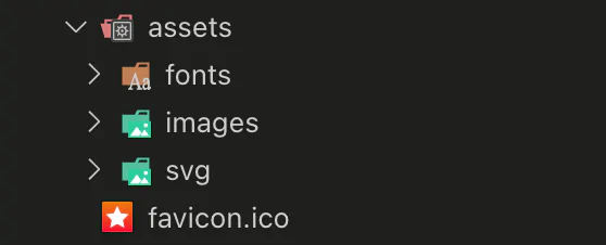
We can add multiple directories here, different for each asset type.
Here’s the list of assets/elements that we should keep in the project:
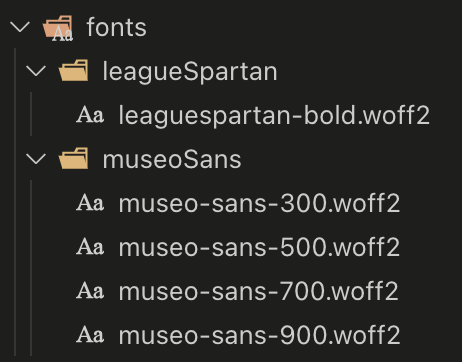
- font files (unless no custom font is needed and we are using a system font instead)
- if we are storing the fonts locally then we should also create a file with a font-face declaration. We should then import it to the file which will be used across the whole application, such as GlobalStyles.
- please add only the variants that will be used in the project, not all that are available.
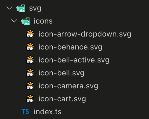
- SVG icons
- it’s important to prepare them properly before using them. We should always get rid of redundant attributes, check the viewBox if it suits our needs, etc.
- sometimes it’s also a good idea to add some styles used for all SVGs to GlobalStyles, such as fill: currentColor to avoid code duplication.
- it’s good to add an icon prefix to the file name – it’s just a good practice to add proper names to files, function names, etc.
- illustrations that will be used in the app all the time or image placeholders
- it’s good to reduce their size before adding them to the repository. To do so we can use https://tinypng.com/ for example.
- here we should use a pic prefix or something similar

- logo
- it’s best to use SVG
- favicon
- we should provide it in all required sizes
USE UI COMPONENT LIBRARY IN YOUR PROJECT
Step 3 – Set global styles
Every project requires some global CSS, such as some reset styles.
We should also set the styles related to HTML and body there, like font size, font family, color, background color, etc.
The styles that will be often used and there won’t be a need to overwrite them (like fill: currentColor set for SVGs) can be also added here. Thanks to this we’re avoiding code duplication. We can use theme fields inside.
Here’s an example of GlobalStyles:
import { createGlobalStyle } from 'styled-components';
import { normalize } from 'styled-normalize';
import reset from 'styled-reset';

export const GlobalStyle = createGlobalStyle`
   ${normalize}
   ${reset}
   html,
   body  {
       padding: 0;
       margin: 0;
       font-family: museo-sans, sans-serif;
       -webkit-font-smoothing: antialiased;
   }

   .is-menu-opened {
       overflow: hidden;
   }

    a  {
       color: inherit;
       text-decoration: none;
   }

   svg  {
       fill: currentColor;
   }

   *  {
       -webkit-font-smoothing: antialiased;
       box-sizing: border-box;
   }
`;
We often use some helper packages such as styled-normalize and styled-reset, so that we don’t have to add some styles by ourselves. We can just use a ready set of CSS reset styles, etc.
Step 4 – Create a theme
A theme is an object that includes sets of variables used in the project. It’s also possible to create component-related variants there, such as typography variants. It’s good to split variable groups into separate files.
Thanks to this the theme object will be a bit smaller and more readable and it will be easier for us to find the needed field.
If we will have multiple themes in the project, it will be also easier to maintain them, because we will be able to use existing objects by just adding them to another theme.
The basic theme should include:
- typography:
- families font
- font weights
- font sizes
- line heights
- colors
- spacings
- layout-related variables (inner size, etc.)
- breakpoints used in the project
Typography
We should prepare styles for all of the headings (h1 – h6) and texts used for descriptions and content of articles.
You can also add styles for texts used as subheadings. It is important that the added variants must be reusable.
We shouldn’t add ones that will be used only in a specific component, e.g. only in buttons, inputs, only in 1 section. Please don’t add colors there, because we may need different colors in some components and it may cause some problems because it’ll be a bit harder to overwrite.
The best approach is to let the color be inherited from the parent element.
It is worth checking how the sizes of the texts change on smaller devices at the beginning and applying needed styles.
This shouldn’t change in other theme versions (of course if we have a few in the project).
src/theme/config/typography.ts
export const fonts = {
 heading: 'league-spartan, sans-serif',
 body: 'museo-sans, sans-serif',
};

export const fontSizes = {
 '10': '0.625rem',
 '12': '0.75rem',
 '14': '0.875rem',
 '15': '0.938rem',
 '16': '1rem',
 '18': '1.125rem',
 '20': '1.25rem',
 '24': '1.5rem',
 '32': '2rem',
 '34': '2.125rem',
 '40': '2.5rem',
 '48': '3rem',
};

export const fontWeights = {
 LIGHT: 300,
 MEDIUM: 500,
 BOLD: 700,
 BLACK: 900,
};

export const lineHeights = {
 XS: 0.875,
 S: 1.1,
 M: 1.125,
 L: 1.3,
 XL: 1.5,
};

export const textStyles = {
 h1: {
   fontSize: ['40', '48'],
   lineHeight: '1.15em',
   fontFamily: 'heading',
 },
 h2: {
   fontSize: ['32', '34'],
   lineHeight: '1.06em',
   fontFamily: 'heading',
 },
 h3: {
   fontSize: '24',
   lineHeight: '1.125em',
   fontFamily: 'heading',
 },
 subheading1: {
   fontSize: '40',
   lineHeight: '1.125em',
   fontFamily: 'body',
 },
 subheading2: {
   fontSize: '20',
   lineHeight: '1.25em',
   fontFamily: 'body',
 },
 subheading3: {
   fontSize: '18',
   lineHeight: '1.2em',
   fontFamily: 'body',
 },
 paragraphLarge: {
   fontSize: '20',
   lineHeight: '1.25em',
   fontFamily: 'body',
 },
 paragraph: {
   fontSize: '16',
   lineHeight: '1.3em',
   fontFamily: 'body',
 },
};
Colors
Color names should be neutral, which means that they shouldn’t be related to any color.
This is because, in the development process, we may need a green color but after a few months a designer may change it to blue and then we will have to change the variable name everywhere it’s used.
Depending on if we will use more than one color theme in the application or just a single one I recommend those approaches:
- when we have only one color theme in the project:
- simple color names, used directly in styled components, like primary, secondary, brand, text, etc, They should be unique.
- matching colors with background colors, like darkBackground and textOnDarkBackground, etc.
src/theme/config/colors.ts
const baseColors = {
 deepBlue: '#151A4F',
 lightGrey: '#F2F5FA',
 white: '#FFFFFF',
 black: '#000',
 primaryGrey: '#A8A6A6',
 paleBlue: '#E0EBFA',
 deepRed: '#DA291C',
 midBlue: '#024EFF',
 successGreen: '#29AE90',
 blackBlue: '#292B40',
};

export default baseColors;
and then in theme:
src/theme/index.ts
export const theme = {
 …
 colors: {
   white: baseColors.white,
   black: baseColors.black,
   primary: baseColors.deepRed,
   primaryBackground: baseColors.lightGrey,
   secondary: baseColors.midBlue,
   secondaryBackground: baseColors.deepBlue,
   tertiaryBackground: baseColors.white,
   headingColor: baseColors.deepBlue,
   warning: baseColors.deepRed,
   paragraph: baseColors.blackBlue,
   success: baseColors.successGreen,
 },
 …
};
- when we have multiple color themes in the project:
- create a color object just like for the single color theme (1st pt.)
- add a separate object with simple color names and then create a variant object for each component that will be using the object with simple color names. In the end, you should have for example a few button variants, each of them should include color, background color, and border color. Each variant should be the same across the themes, we should only change the values inside. In this case, we will have multiple theme objects in the app.
src/theme/index.ts
export const theme = {
 …
 colors: {
   …
   button: {
     primary: {
       color: baseColors.white,
       backgroundColor: baseColors.deepRed,
       borderColor: baseColors.deepRed,
     },
     secondary: {
       color: baseColors.white,
       backgroundColor: baseColors.midBlue,
       borderColor: baseColors.midBlue,
     },
     outline: {
       color: baseColors.deepBlue,
       backgroundColor: baseColors.white,
       borderColor: baseColors.deepBlue,
     },
   }
 },
 …
};
We can also add those components color themes in the same directory as the component in a file called theme.ts or just consts.ts.
Spacings
When it comes to spacings, it is a good idea to stick to multiples of one number, for example, 4. This way we will avoid differences in spacings in different sections and the design will be consistent.
In the case of web applications, it is good to use rems, remembering to leave some comments with conversion to pixels – it will make it easier to find the right size because designs are most often prepared with pixels.
In mobile applications, we should use pixels (because otherwise, it won’t work).
src/theme/config/space.ts
const space = {
 XS: '0.25rem', // 4px
 S: '0.5rem', // 8px
 M: '1rem', // 16px
 L: '2rem', // 32px
 XL: '3rem', // 64px
 XXL: '4rem', // 128px
};

export default space;
Layout-related variables
This should include all layout variables, such as inner sizes.
src/theme/config/sizes.ts
const sizes = {
 inner: {
   default: '90rem', // 1440px
   narrow: '62.5rem', // 1000px
 },
 gutter: '1.5rem', // 24px
};

export default sizes;
Breakpoints
In our projects, we often use the mobile-first approach.
This is handled by the styled system by default. We should add all of the screen sizes that are needed to apply some layout changes to the breakpoints field in the theme.
It’s a good practice to use aliases – this will make it easier to add new breakpoints during the later stages of implementation. If we use rems in the project, breakpoints should also be given in this unit.
src/theme/config/breakpoints.ts
const breakpoints = [0, '41.75rem', '64rem', '90rem'];

export default breakpoints;

export const mediaQueries = {
 MOBILE: `@media screen and (min-width: ${breakpoints[0]})`,
 TABLET: `@media screen and (min-width: ${breakpoints[1]})`,
 DESKTOP: `@media screen and (min-width: ${breakpoints[2]})`,
 DESKTOP_LARGE: `@media screen and (min-width: ${breakpoints[3]})`,
};
Creating media queries aliases may be handy as well. We can use them later when creating some styled-components.
Final theme
The final theme file can look like this:
import baseColors from './config/colors';
import space from './config/space';
import sizes from './config/sizes';
import breakpoints from './config/breakpoints';
import {
 fontSizes,
 fontWeights,
 lineHeights,
 fonts,
 textStyles,
} from './config/typography';

export const theme = {
 breakpoints,
 fontSizes,
 fontWeights,
 lineHeights,
 fonts,
 textStyles,
 colors: {
   white: baseColors.white,
   black: baseColors.black,
   primary: baseColors.deepRed,
   primaryBackground: baseColors.lightGrey,
   secondary: baseColors.midBlue,
   secondaryBackground: baseColors.deepBlue,
   tertiaryBackground: baseColors.white,
   headingColor: baseColors.deepBlue,
   warning: baseColors.deepRed,
   paragraph: baseColors.blackBlue,
   success: baseColors.successGreen,
 },
 space,
 sizes,
};
As you can see, it’s really small. You can include other variables here as well. Y
As you can see, it’s really small. l, so Yyou can include other variables here as well.
You may need some shadows or z indexes or border radiuses and here’s the place where you can add them.
They will be available to use via theme prop or you can use the useTheme hook from styled-components to use some objects directly in the file with the component’s logic (index.tsx)
Step 5 – Build the components
Let’s create a newsletter section. It should include:
- title
- description
- email input
- submit button
So we have to prepare a few components which are:
- Typography
- Input
- Button
- NewsletterForm
- NewsletterSection (for section layout)
Prepare project structure
We can now create some directories related to the atomic design methodology.

It’s good to keep all component-related files in the same directory. It’s easier to find any needed element and it keeps the project “clean”.
This is why I have a similar structure inside each component’s folder. The files that I’m adding the most often are:
- index.tsx – with component’s main logic
- types.d.ts – a file with types/interfaces, you can create a separate interface for styled component and for the main component; the styled interface can be used only inside this file just to apply some changes to component’s styling, or it can be also used to extend the main interface
- styles.ts/tsx – file with the styles
We may also need some additional files to store some variables or add a custom hook that will be used in the component, so we can add:
- consts.ts/tsx – for variables, mock data
- utils.ts/tsx – for utility functions, that we don’t want to keep in index.tsx file
- hooks.ts/tsx – for custom hooks, that will be used only to do something in this particular component
If we’ve added Storybook to the project, we may also need index.stories.tsx file

Create the smallest elements (atoms)
In the initial phase of creating components, we need to focus on atoms.
These will be the smallest elements that will later be used in molecules and organisms. In each project, you can find the same kind of atoms.
Those are the components that will look the same on every page/subpage. These are, for example:
- buttons
- links
- form elements, like:
- text inputs
- checkboxes
- radio buttons
- selects
- datepickers
In these components, we will use the elements created earlier when adding the basic theme.
It is also worth checking and adding all the states they can be in, e.g. what the buttons look like when they are covered or in the disabled state, what the input looks like when there is an error, etc.
It is good to adopt an iterative strategy when creating such components. Not everything has to be added all at once. Subsequent changes may appear while creating new molecules and organisms.
Adding the storybook
* Additionally we can add Storybook to the project. It will make creating the components easier and quicker. We will be able to test the component before it will be used somewhere and we won’t have to run the main app to implement the code and see how the element looks like after our changes. Storybook addons can be also helpful with creating documentation and we can see how the component changes within each media query breakpoint.
To create our newsletter section we should add Typography, Button, and Input.
We can also add helper boxes (from the protip) in another directory, which I always name as styles.
If you have some elements which don’t require any logic but are used for the layout appearance then this folder is the best place to add such things.
Just remember not to overuse it. There shouldn’t be many elements inside, only the ones that will be highly reusable across many different components.
Those components can’t be related to the places where they will be used, so their interfaces should be simple and should include only the props that will make some changes in the component itself, they shouldn’t be used do add spacings, etc.
So our Button component can have an interface like this:
types.d.ts
import { ButtonHTMLAttributes } from "react";

import { buttonMode, buttonSize } from "./consts";

export type ButtonVariant = keyof typeof buttonMode;

export type ButtonSize = keyof typeof buttonSize;

export interface StyledButtonProps {
 mode?: ButtonVariant;
 size?: ButtonSize;
 disabled?: boolean;
 isFullWidth?: boolean;
}

export type ButtonProps = ButtonHTMLAttributes<HTMLButtonElement> &
 Omit<StyledButtonProps, "disabled">;
For the button to make it work correctly, we need to add ButtonHTMLAttributes<HTMLButtonElement> interface.
It contains all button-related props that we may want to use. Additionally, we want to change the button’s appearance, so that it can have different modes, sizes and can be expanded to be full width and that’s why we have this StyledButtonProps interface.
It was used to extend button props and to change the styles in the styles.ts file.
styles.ts
import styled, { css } from "styled-components";
import { variant } from "styled-system";
import { mediaQueries } from "../../../theme/config/breakpoints";
import mixins from "../../../theme/mixins";

import { buttonMode, buttonSize } from "./consts";
import { StyledButtonProps } from "./types";

export const Button = styled.button<StyledButtonProps>`
 font: inherit;
 border-width: 1px;
 border-style: solid;
 cursor: pointer;
 display: flex;
 align-items: center;
 justify-content: center;
 ${mixins.transition()};
 ${variant({
   scale: "mode",
   prop: "mode",
   variants: buttonMode
 })}
 ${variant({
   scale: "size",
   prop: "size",
   variants: buttonSize
 })};
 ${({ disabled }) =>
   disabled &&
   css`
     ${mixins.disabledStyle(disabled)}
   `}
 ${({ isFullWidth }) =>
   isFullWidth &&
   css`
     width: 100%;
   `}
 ${mediaQueries.DESKTOP} {
   &:hover {
     opacity: 0.5;
   }
 }
`;
Inside the consts.ts file I’m keeping configs for button modes and sizes:
consts.ts
export const buttonMode = {
 primary: {
   backgroundColor: "primary",
   color: "white",
   borderColor: "primary"
 },
 secondary: {
   backgroundColor: "tertiaryBackground",
   color: "headingColor",
   borderColor: "secondaryBackground"
 },
 outlined: {
   backgroundColor: "tertiaryBackground",
   color: "warning",
   borderColor: "warning"
 }
};

export const buttonSize = {
 small: {
   padding: "0 0.75rem",
   fontSize: "10",
   fontWeight: "REGULAR",
   lineHeight: "2em",
   borderRadius: "0.313rem",
   letterSpacing: "0.03em",
   minHeight: "1.563rem"
 },
 medium: {
   padding: "0.625 2rem",
   fontSize: "12",
   fontWeight: "REGULAR",
   lineHeight: "1.3em",
   borderRadius: "0.625rem",
   minHeight: "2.188rem"
 },
 big: {
   padding: "0.5rem 2rem",
   fontSize: "16",
   fontWeight: "REGULAR",
   lineHeight: "1.6em",
   borderRadius: "0.625rem",
   minHeight: "3.438rem"
 }
};
And the final component looks like this:
index.tsx
import React from "react";

import * as Styled from "./styles";
import { ButtonProps } from "./types";

const Button: React.FC<ButtonProps> = ({
 children,
 mode = "primary",
 size = "big",
 type = "button",
 ...rest
}) => (
 <Styled.Button {...{ mode, size, type, ...rest }}>{children}</Styled.Button>
);

export default Button;
Typography and Input components are created in a similar way.
Use the smallest elements to create bigger ones (molecules)
Now that we have all of the needed “Lego bricks”, we can finally start stacking them, so now we will start working on some molecules. In this case, we need only one, which is NewsletterForm.
We want to connect Input with Button and create a form. We should be able to pass props to each component and also to the form, so we can create an interface like this:
types.d.ts
import { FormEventHandler } from "react";
import { ButtonProps } from "../../atoms/Button/types";
import { InputProps } from "../../atoms/Input/types";

export interface NewsletterButtonProps extends ButtonProps {
 label: string;
}

export interface NewsletterFormProps {
 onSubmit?: FormEventHandler<HTMLFormElement>;
 inputProps?: InputProps;
 buttonProps?: NewsletterButtonProps;
}
For the sake of simplicity, I have only added one form-related prop in this example. I’m using the interfaces that I’ve prepared earlier and extending the NewsletterFormProps interface with onSubmit prop to keep the form’s functionality. We don’t have to create a file for the styles, because we can use some boxes from helpers and the final component looks like this:
index.tsx
import React from "react";
import Button from "../../atoms/Button";
import Input from "../../atoms/Input";
import { GridBox } from "../../styles/helpers";
import { NewsletterFormProps } from "./types";

const NewsletterForm: React.FC<NewsletterFormProps> = ({
 onSubmit,
 inputProps,
 buttonProps
}) => {
 const { label, ...restButtonProps } = buttonProps || {};

 return (
   <GridBox
     as="form"
     gridTemplateColumns="1fr auto"
     gridColumnGap="1rem"
     alignItems="end"
     {...{ onSubmit }}
   >
     <Input
       type="email"
       placeholder="Enter email address here"
       {...inputProps}
     />
     <Button {...restButtonProps}>{label || "Submit"}</Button>
   </GridBox>
 );
};

export default NewsletterForm;
Build the final component (organism)
We can use our molecules as other “Lego bricks” and create another component with them. In this example, we will create NewsletterSection which will include NewsletterForm, Typography, and some helper boxes.
Its interface should allow passing props to all of the components that we may want to modify when using this organism, so the interface may look like this:
types.d.ts
import { NewsletterFormProps } from "../../molecules/NewsletterForm/types";

export interface NewsletterSectionProps extends NewsletterFormProps {
 title: string;
 description: string;
}
So now we have access to all props from the NewsletterForm component and we extended them with title and description.
And the component looks like this:
index.tsx
import React from "react";
import Typography from "../../atoms/Typography";
import NewsletterForm from "../../molecules/NewsletterForm";
import { Box, GridBox, Inner } from "../../styles/helpers";
import { NewsletterSectionProps } from "./types";

const NewsletterSection: React.FC<NewsletterSectionProps> = ({
 title,
 description,
 ...rest
}) => {
 return (
   <Box as="section" py="2rem">
     <Inner>
       <Typography variant="h2" mb="1rem" fontWeight="BOLD">
         {title}
       </Typography>
       <GridBox
         gridTemplateColumns="repeat(2, 1fr)"
         gridGap="2rem"
         alignItems="start"
       >
         <Typography>{description}</Typography>
         <NewsletterForm {...rest} />
       </GridBox>
     </Inner>
   </Box>
 );
};

export default NewsletterSection;
Now we can use this one when creating a page and we will be able to change the texts inside, the appearance of the button, pass the onSubmit function to the form, etc.
All of those components that were used inside NewsletterSection can be also used outside it, which means that they are reusable.
You can check the live example here.
Best practices for building UI components
For the code to be readable and easy to modify at a later date, there are a few rules to follow.
When creating a component, we must consider what function is to be fulfilled and what API should be created in order to fulfill this function.
It shouldn’t be overcomplicated – the key is simplicity. If a component starts to be very complex, maybe it is worth dividing it into several smaller ones?
The code will be much clearer and easier to change if necessary. Remember about component reusability
Components should be reusable.
We should be able to use them in many places and they should not be tied to any specific section. Spacings and widths can be defined later using the wrapper at the point where we use the component.
Example
We need to do a newsletter section. Both form elements are arranged one below the other on the mobile and in a row on the desktop.
Additionally, there are spacings between the components. Earlier, we had prepared the necessary atoms – input and button. Input always expands to 100% of its width, the button takes the width depending on the content.
In this case, we need three wrappers. One of them may be the form.
<form>
 <div>
   <Input placeholder="E-mail" type="email" required />
 </div>
 <div>
   <Button type="submit">
     Submit
   </Button>
 </div>
</form>
We add the styles needed to arrange the elements in one row. The next two wrappers will be needed to limit the width of the input and to add a margin between the input and the button.
Thanks to wrappers, we will avoid adding a lot of props to simple components. Then you do not need to handle all the possibilities of arranging a given element in the layout in one component.
Protip
You can create a component that can be used for positioning and spacing, such as the StyledBox.
Using styled-system we can add styles related to space, layout, and flexbox. Thanks to this, we will have access to props related to margins, paddings, width, height, and those related to flexbox.
import {
 SpaceProps,
 FlexboxProps,
 LayoutProps,
 flexbox,
 layout,
 space
} from 'styled-system';

export type StyledBoxProps = SpaceProps & FlexboxProps & LayoutProps;

export const StyledBox = styled.div<StyledBoxProps>`
 ${space};
 ${flexbox};
 ${layout};
 display: flex;
`;
When we use theme-UI we can just use the Box, Flex, or Grid components. All of them have spacing-related props.
This way, you don’t have to create separate styled-components for the layout for each component. There is much less code when using it.
Use simple components names
This is perhaps the most important of the rules. Thinking about the name for too long is not good.
It is best if the name simply reflects what the component can be used for. It should not be related to its place of occurrence, i.e. we should have a Button component, but CheckoutButton would mean that it can only be used for checkout – which contradicts the principle of reusability of components.
If a given component appears only in one place and we are 100% sure about it, instead of adding it as a separate atom/molecule/organism, we can simply add it in the folder next to the component in which we use it.
We can name this folder as partials and throw everything related to such a component there.
Examples of good component names:
- Button
- Input
- ActionCard
- Accordion
Set simple props names
It is best to keep the names as simple as possible.
When there is only one place to use a href in a component, it makes no sense to add a prefix or suffix to it, for example, linkHref or avatarHref, etc.
Before we send the code to Code Review, let’s check if everything is simple and readable. Prefixes and suffixes should only be added when a simple props name matches more than one element.
Examples of good prop names:
- title
- items
- buttonProps
- avatarUrl and backgroundUrl (if we for example have a author bio section with 2 images inside – one for author’s avatar and another one for the bio’s background)
Group props and reuse the existing types and interfaces
Suppose we have prepared a Link component beforehand and want to use it in some molecule.
It would be good to have access to all props of the Link component in it. To achieve this, we can add a prop, e.g. linkProps, and give it a type that is used in the Link component.
Another example would be simply using a component in a molecule/organism and extending the interface if the props do not repeat.
However, if the prop names are repeated, but you still want to use the interface, you can use utility type Omit, “extract” the duplicate name, add another prop with a prefix or suffix, and assign it the “pulled” prop type.
Separate props roles
By setting a type prop to the button, we do not change its other functions, and when adding props related to the styles, we shouldn’t change the appearance of the entire component with one prop.
Better to make a few props that will be responsible for a single thing than one that will do everything. This will make it easier to apply changes and the component will be more “flexible”.
Example
There’s a button that comes in several colors and sizes.
In the style guide provided by the graphic designer, some buttons occur only in one size.
When creating the sections later, we notice that one of these buttons may also be of a different size than declared in the style guide.
We can use two props to achieve the right result: mode – for the color version and size – for the size.
If we were to set the size on the basis of the color version (mode), we would have to add a separate condition to change the size of this one type of button.
If we changed the size regardless of the mode, then no additional changes would be needed – any mode can exist in any size.
Iterate
We don’t have to create components that will fulfill all their functions right away.
It is worth starting from scratch and then adding what is needed in subsequent iterations when creating new elements.
Thanks to this, we will avoid a situation in which we will do something that will not be used later. We will not spend more time than necessary on implementing the component.
Control your work
After finishing the component, always check if it is simple and legible if there are no strange names anywhere if all cases are “covered” if some redundant React Fragment wasn’t left somewhere, etc.
Summary
So, we made it!
I hope now you know how to build reusable components that have great quality, are easy to test, maintain and change in case of design updates.
As I’ve mentioned before, let me know what you think, and if there’s anything I should add!
Thanks for reading!
READ MORE
The Difference Between UI and Front-End Developers