

Introduction
Carrying out a design project can be incredibly complex and taxing.
Last week, I had a call with a small company CTO whose project required quite a bit of customization in the front-end layer. I asked him whether he had considered using a design system, such as a component library, to get things moving a little bit quicker—he didn’t know what I was talking about.
I explained to him what a component library is, and once he’d grasped the general idea, it became clear that in his particular case it would be best to ditch the library as it would be simply much better to create all of the necessary user interface elements from scratch, rather than customize and edit the entire library.
Save Yourself Some Time and Money
That, however, was his unique case. By making the call and simply asking he’d saved hundreds of hours his team would have to spend editing the front-end layer of the project that, in the end, would have probably had to be built from zero anyway.
Your case may be entirely different and that’s exactly why we’ve decided to prepare this article. Trust me, you don’t want to wake up one day thinking ‘Gosh! I should’ve spent 10 minutes reading that article that day. This little maneuver is gonna cost me 51 years!’

Do yourself a favor. Read on and find out what is best for your particular situation. Save yourself some time and money.
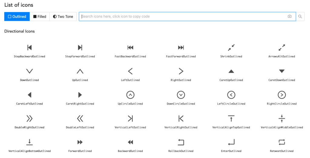
What Is a UI Component Library?
There are plenty of advantages of using the most popular JS libraries like React or Vue. But you already know that.
One of the biggest perks of working with those libraries is that you get access to a very sizable collection of ready-made UI elements. These materials can greatly facilitate the work of your developers, allowing them to either directly apply them in a project, or modify them, achieving more of a custom feel.
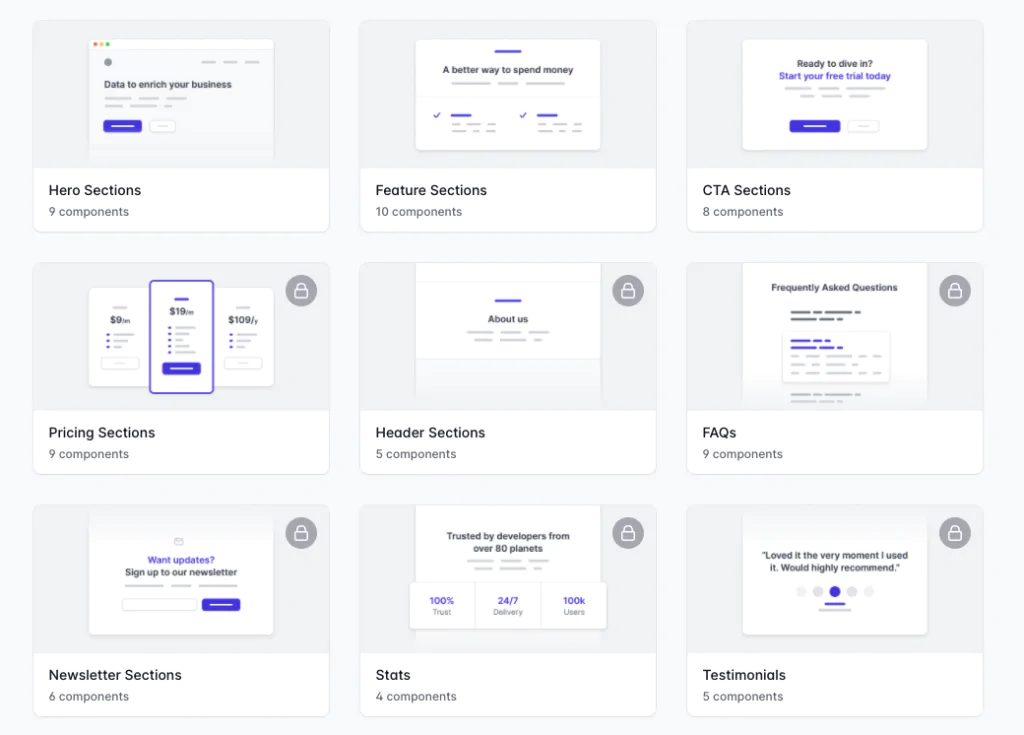
A UI library, in the simplest terms, is a collection of materials, or components, that you can readily use or modify to meet your needs. You can think of UI components as single elements available in that library, such as buttons, input fields, or banners made out of pure HTML and CSS.
Some of the most well-known libraries would be Ant Design, Tailwindui, or MUI. Design programs such as Figma or Adobe XD also have their own, rich component libraries.
Keep in mind that whether you’re using Angular.js, Vue, React, or any other front-end JS library, you will also be using a different component library for each.
When working on a project you will basically always have to make a choice: do I build all of my UI elements from nothing, or do I save me and my team some time and effort by making use of premade components?
A UI library is where you go when you have decided on the latter. It’s also a great place to go for inspiration for material design as it’s entirely up to you what you decide to do with the components you find there.
Alright, let’s figure out when it’s best to use the ready-made materials available within UI component libraries and when it’s a better bet to design these elements from scratch.
Build your own UI component library
When to Use a UI Component Library?
You might be asking yourself: why bother creating your own components when you can just use the ready-made ones? Seems like a no-brainer at first, but hear me out.
The answer is slightly more obscure than you might think. Before deciding on either, you need to know your project inside-out. You need to consider things like your project’s deadline, the amount of front-end work that has to be done, the size of the project, or the experience of your developers and UI designers.
You also need to think about your budget and ask yourself whether the originality is worth the extra buck, or if you’d rather save some money and have a slightly more conventional design.
Functionality Instead of Visual Aspects
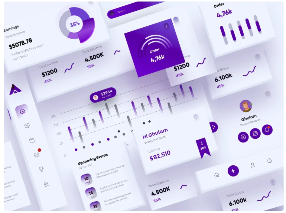
When you decide on using a UI library, you might have to hold your creative horses, which might consequently limit the visual part of your project. That said, if all you want is a good-looking, fully-functional website or app, then a component library will probably satisfy all of your needs and then some.
A good example of such a project would be building an administration panel. Admin panels are meant to be clear and easy to use. What we’re looking for is a responsive, functional, and intuitive interface that works. In this case, a component library should be an obvious choice.
Proof of Concept Project
When you have a vision of your final product it can be incredibly tempting to throw yourself into it and just start building everything from scratch. I know, I’ve been there.
However, whenever you find yourself in a situation where you’re not a hundred percent sure of what the final result of that particular project will look like, just take a deep breath and stop for a minute.
Instead of funneling resources into designing your own elements, you might as well use the ready-made UI elements and test your idea and the functionality of your project at an early stage.
This is one of those situations where you should definitely slow down and use a library before blowing your resources on the world’s coolest-looking search bars. Come on!
A Limiting Budget of the Project
What’s an unquestionable advantage of using a UI library is that there is less work to be done in general. While designing original components you have to pay developers and designers to write them up and make them functional.
If you use a library, all you need to do is find the right UI elements and either use or edit them to fit your own needs—up to you. When on a budget, go for a component library. It will do just fine.
No Designer on the Team
Designers are highly-skilled professionals, and, as we all know, highly-skilled professionals can get expensive.
Similar to the previous example, there are times when you don’t want to burn half of your budget just to get a custom look. Sometimes you want and need to get the project running ASAP without paying crazy money for it.
If you’re in this place, go with the UI library. You’ll be surprised at how far you can get with minimal design skills & experience by simply following the guidelines.
Lacking the Means to Build Your Own Component Library
If your team lacks the skills to build a fully custom brand library, you also might be better off using one that is already there.
As your business continues to grow, there will probably be a time when you want to build your own library from scratch. However, that should not be rushed as your ideas and capabilities change as you and your company continues to develop.
Use a UI library first and test the waters. There will still be time to build your visual identity.
Aiming for the Overall Ease of Use
From time to time we all want to let our artistic side run amuck, designing fonts, logos, menus, and whatnot. That’s all great, as long as you are a hundred, or at least 99.9 percent certain, that all of this is truly worth your team’s time and effort.
In a perfect world, we would all love to have a team of designers and developers just waiting for us to make a call to start a new project, build the style guide and design a completely custom library just for us.
However, in reality, our hands might be a tiny bit more tied than we would otherwise like. In that case, it might be best to forego that vision just for now and reap the benefits of the overall ease of use that using premade components brings us.
Component libraries are very intuitive, user-friendly, well-organized, and offer highly readable guidelines that are very easy to follow. To make your life even easier, all you need to do to make it work is copy and paste code snippets. Pretty good?

In the end, if you want to complete a project without overwhelming and overworking your team, just go with a library, use common UI elements and spend some of that money to buy your team some pizza once they’ve finished (or sushi if they did really well!).
Improved Accessibility
Have you ever heard of pubs? Well, allow me to explain. A pub is a place where folks meet, watch a game, have a few drinks, and jolly, jolly time. In short, it’s a perfect place to meet your buddies.
A UI library is just like a pub. It’s the perfect place for your developers to meet your designers who, obviously, are the best of buddies. It’s a perfect workshop environment where all of the available components can be easily accessed by everyone in the team.
When you’ve got all of that in one place it’s suddenly so much easier to get a clearer view of all of the UI. Whenever you need to search for one component that you need, it’s always going to be there, making life so much easier for everyone. Pubs make people happy, and so do UI component libraries.
Reduced Code Duplication
All of the elements in a UI component library have been created in isolation, which makes them both reusable and visible to other devs.

That, in turn, makes the system more foolproof. Each time somebody needs to design components, they can easily check the library before committing time to building a new one and possibly duplicating an already existing element. Remember, component libraries are like pubs. They make people happy.
Enhanced Consistency
Think back to your school days. When you were still going to school, each grade had a set of given coursebooks for each class. Be it math, history, or English, the coursebooks had to be the same for all of the students in a given class. And why wouldn’t they? Can you imagine the chaos and the discrepancies having different coursebooks would’ve caused?
Similarly, it is much easier for your team to work using one set of components and that’s exactly what a library gives you. Regardless of the number of people working on the project, all of the components come from one ‘coursebook’—the UI component library of your choice. Consistency guaranteed.
Speed and Compatibility
The fact that you can easily access and re-use each UI element in a matter of seconds can have a major impact on the overall speed of the development process.
With the entire team on the same page, it’s much easier to cooperate, making the entire process quicker. Plus, having all of the materials in a single place makes it far easier to maintain compatibility across different devices.
Quick poll
Have you ever used a UI component library?
Potential Challenges of Using a UI Component Library
As handy as they are, component libraries, like everything else, do have a couple of drawbacks. Let’s see what they are and how they might affect your project.
A Generic Look
I’ve touched on this briefly earlier, but allow me to elaborate.
When using stock components for building UI design your project will inevitably look less original. There are thousands if not millions of people using the exact same components, sometimes with small modifications, as you. So, quite naturally your project might look somewhat like theirs.
Moreover, to some extent, the feel of your website or app will be pre-determined by the style of the UI elements you decided to use.
In other words, this is inevitably going to be a less creative endeavor, so if you are at a phase when you’re aiming at building your own brand library, you should probably ditch this and move on to designing the look from scratch.
Change of Design Direction
One thing I’ve learned the hard way is that it is incredibly key to understand where you are going with your project before you put any time and effort into it.
A huge downside of using a UI component library is that it’s painfully difficult to overwrite what has already been built, so if you decide that you want to change your design halfway it will be far more difficult than it would have been if you were editing your original components.
Bundle Size
Another thing to consider when deciding on whether a component library is for you or not is the size of your project.
Component libraries tend to be on the bigger side, so if you decide to go with it you might just load a bunch of code you may never use afterward. When working on a small project that does not require your team to create too many elements, it might be best to just go ahead and build everything from scratch.
All in all, whether you decide to use a UI component library, or build all elements on your own, make sure you understand that you are making a commitment. Switching from one to the other when you’re halfway done and changing your mind is not a good idea.
When Is It Better Not to Use the UI Component Library?
Okay, now that you’re all-in on committing to using a UI library, let’s take a breather and backpedal just a notch.
We’ve talked A LOT about all the advantages that it brings to the table. Now, to maintain some balance, let’s talk a bit about the few potential downsides it might present.
Large Projects
When working on bigger projects, and especially when focusing on creating your brand’s personalized look and visual identity, it might be better to create all of the components from scratch.
If you plan everything out and have a team capable of pulling it off, creating your own look will probably pay off in the future. By doing so, you will be in reality building a library of your own that is fully compatible with your brand.
In the future, once you decide to expand and create sub-brands, you will already have a library to draw from. Think Uber and Uber Eats. Amazon and Amazon Go. macOS and Windows 11 (sorry Windows fans).
Do keep in mind that this process does take a lot more time and often simply styling and editing ready-made components is much easier and more efficient. However, if there is too much styling required, you might find yourself better off creating your own style library instead. The estimate is up to you.
Extensive Scope & Budget
It’s kind of like with everything else—if you have the money to do it, why not just do it? Of course, having your own branded visual identity is a great thing and if you have the means and the budget it should be an easy choice.
Companies like Netflix, Apple, Microsoft, or Uber don’t even take a minute to think about which way to approach this conundrum—it’s purely a small company thing. If you can design your own look without overloading your team, you should probably just do it!
Let’s Wrap This Up
Most of the time, the readily-available UI components are a pure joy to work with. When used in the right type of project they save you time, effort, and money. In the vast majority of cases, using a UI component library will be a smarter choice, combining top quality with fair pricing.
The bottom line is that if you are looking to create a visual identity for your company that you know will remain that way for a long time (think big companies like Netflix or Amazon) and can do so without straining your budget, go for it.
However, if it’s a one-project thing with a smaller budget, go with ready-made components. Voilà!

Build your own UI component library
Read more
UX and UI design in a mobile app development process
How to design a website for better conversion?
The difference between UI and frontend developers


