TL;DR
• Tailwind CSS allows developers to build modern user interfaces using small, reusable utility classes instead of writing custom CSS styles.
• The framework speeds up frontend development by enabling rapid styling directly in HTML or component files without switching between markup and separate stylesheet files.
• Tailwind provides a configurable design system with predefined spacing, colors, typography, and responsive utilities that help maintain consistent UI patterns.
• Developers can customize the framework through a configuration file to match project design requirements and extend the default design tokens.
• Tailwind is widely used in modern frontend stacks with frameworks like React, Next.js, and Vue.js.
• Understanding how Tailwind works helps teams build responsive, maintainable interfaces while reducing the need for large custom CSS codebases.
Getting Started with Tailwind v4
Tailwind CSS is a CSS framework well-known and loved by beginners and experienced devs. Version 4.0 has been further optimized for performance and flexibility. Its configuration and customization have been completely reimagined, prompting many to ask themselves: how to use Tailwind?
Since this update introduced performance improvements and new features, we’ve prepared an overview of what is new in Tailwind v4.0 and how to install it. After reading it, you’ll be able to:
- Set up Tailwind CSS v4.0 with zero configuration required
- Use v4.0’s new utilities and dynamic features in React applications
- Explore advanced techniques, like container queries, 3D transforms, modern gradients, and responsive design patterns
- Migrate from Tailwind CSS v3 to v4
What is Tailwind and Why Is It Used?
Tailwind CSS is a utility-first CSS framework that lets you build custom user interfaces quickly by applying classes directly in your HTML or JSX.
Instead of writing custom stylesheets, you compose designs by combining small, reusable utility classes like p-4, text-center, or bg-blue-500. It speeds up development, improves consistency, and works well in component-based frameworks like React or Next.js.
How Does Tailwind Work?
Tailwind provides a pre-defined set of utility classes based on a design system (spacing, color, typography, etc.). These classes are compiled into a CSS file that gets applied to your app. It keeps the size of your CSS bundles small with features like JIT (Just-In-Time) mode and configuration-based theming.
Is Tailwind Good for Beginners?
Yes, especially for beginners who already know some HTML. It lets you see the results of your styles immediately, without needing to understand advanced CSS concepts like specificity, BEM, or media queries.
That said, it does have a learning curve around class names and best practices. Once you’re past that, building responsive UIs becomes second nature.
How to Use Tailwind Effectively?
Start by installing Tailwind via a build tool (we recommend Next.js or React). From there:
- Stick to utility classes for layout, spacing, and color.
- Use
@applyand components when patterns repeat. - Customize the
tailwind.config.jsfile to match your design system. - Take advantage of responsive, hover, and dark mode variants.
- Keep your HTML readable by using composition or extracting components when needed.

What Are the Downsides of Tailwind?
Although it’s an amazing tool, there are a few drawbacks of Tailwind you should be aware of:
- It can make your HTML look cluttered if not structured well.
- Understanding utility naming and variants in Tailwind might take some time.
- Without thoughtful configuration, it’s easy to go off-brand.
- You may miss the separation of styles and markup in certain use cases.
Still, most of these are manageable with good conventions and tools like Prettier, ESLint, or component libraries.
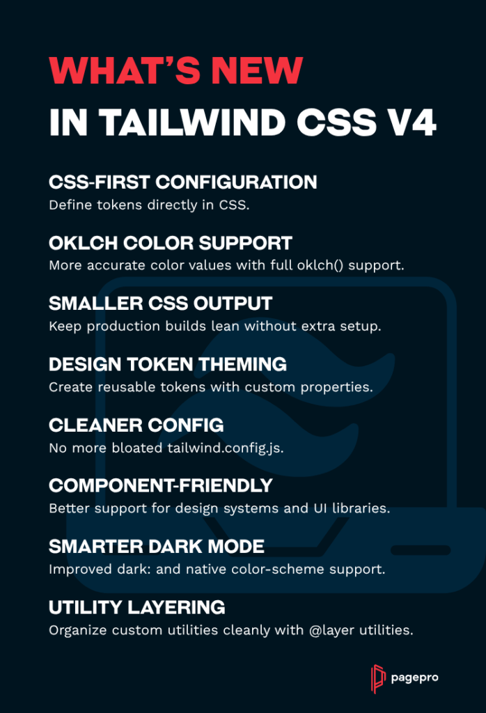
What’s New in Tailwind CSS v4.0?
To get a better idea of how revolutionary Tailwind CSS v4.0 is, have a look at some of its improvements:
Performance Revolution
Full builds are now up to 5x faster. Impressive? Incremental builds are over 100x faster, and measured in microseconds. The new Oxide engine delivers:
- Full rebuilds 3.78x faster (from 378ms to 100ms)
- Incremental rebuilds with new CSS 8.8x faster (from 44ms to 5ms)
- Incremental rebuilds with no new CSS 182x faster (from 35ms to 192µs)
Modern Web Standards
Tailwind v4.0 is built on cutting-edge CSS features like cascade layers, registered custom properties with @property, and color-mix(). This includes:
- Native cascade layers for better style control
- Registered custom properties for enhanced performance
color-mix()for dynamic color manipulation- Logical properties for simplified RTL support
Improved Developer Experience
Developers can now enjoy a much simpler and modernized development process thanks to:
- Zero configuration that doesn’t require
tailwind.config.js - Automatic content detection. Template files are now discovered automatically
- CSS-first configuration that lets you customize directly in CSS
- Single line setup with
@import "tailwindcss"
Knowing what’s changed, we can now move to the installation process.
When Did Tailwind v4 Come Out?
Tailwind CSS v4.0 was released on January 22, 2025. It introduced a fully CSS-first configuration model, improved performance, and better support for design tokens and native color spaces like OKLCH.
Is Tailwind v4 Better Than v3?
It is, if you care about design systems and performance. Tailwind v4 removes the need for JavaScript-based config in many cases, thanks to its new @theme and @tokens support.
It also integrates better with native CSS features and gives you more control over theming, while still supporting everything from v3.
Tailwind v4 vs v3 Comparison
| Feature | Tailwind CSS v3 | Tailwind CSS v4 |
| Configuration Format | JavaScript-based (tailwind.config.js) | CSS-first with @theme & design tokens |
| Design Token Support | Limited, mostly via JS config | Full token-based theming using CSS variables |
| Color Format | Hex, RGB, HSL | Adds full OKLCH color support |
| Custom Properties | Optional, manual setup | Native token support with --color-*, etc. |
| JIT Compiler | Improved JIT with smaller output & better performance | Improved JIT with smaller output & better perf |
| Dark Mode Handling | media or class strategies | Enhanced with color-scheme support |
| Container Queries | Not built-in | Built-in support |
| 3D Transforms & Gradients | Basic support | Modern transforms and layered gradients |
| Performance | Fast builds with JIT | Even faster with smarter dependency tracking |
| Utility Layering | Manual with @layer | Enhanced control with @layer utilities |
| Ease of Theming | Relies on complex config files | Simplified, design-token-based theming |
Need Experienced developers for your next project?
How to Install Tailwind CSS v4.0
Step 1: Install Tailwind CSS v4.0
Install Tailwind CSS v4.0 using npm:
npm install tailwindcss @tailwindcss/postcss
Changes from Tailwind v3:
- Fewer dependencies are required
- No separate initialization command needed
PostCSSplugin is included by default
Step 2: Configure PostCSS (Traditional Method)
Create or update your postcss.config.js file:
// postcss.config.js

export default {
  plugins: ["@tailwindcss/postcss"],
};
Step 2 Alternative: Use with Turbopack (Recommended for Next.js Users)
If you’re using Next.js with Turbopack, you can integrate Tailwind CSS v4.0 directly. First, make sure you’re using Next.js 15+ with Turbopack enabled:
// next.config.js

/** @type {import('next').NextConfig} */
const nextConfig = {
  experimental: {
    turbo: {
      rules: {
        '*.css': {
          loaders: ['@tailwindcss/postcss'],
          as: '*.css',
        },
      },
    },
  },
};

export default nextConfig;
For development with Turbopack:
npm run dev -- --turboOr for production builds:
npm run build -- --turboStep 3: Import Tailwind in Your CSS
Add @import "tailwindcss" and start building. That’s it, no more @tailwind directives, only a single line of CSS.
Create your main CSS file (e.g., src/styles.css) and add:
/* src/styles.css */

@import "tailwindcss";
Big change: No more separate @tailwind base;, @tailwind components;, and @tailwind utilities; directives!
Step 4: CSS-First Configuration (Optional)
Instead of a tailwind.config.js file, you can configure all of your customizations directly in the CSS file where you import Tailwind:
/* src/styles.css */

@import "tailwindcss";

@theme {
  --font-display: "Inter", "sans-serif";
  --breakpoint-3xl: 1920px;
  --color-brand-100: oklch(0.99 0 0);
  --color-brand-200: oklch(0.98 0.04 113.22);
  --color-brand-500: oklch(0.84 0.18 117.33);
  --spacing-18: 4.5rem;
  --ease-bounce: cubic-bezier(0.68, -0.55, 0.265, 1.55);
}
Step 5: Automatic Content Detection
One of the biggest pain points in v3 was configuring that annoying content array. The Tailwind team has solved this in v4.0 with automatic detection that scans your project intelligently, no configuration needed! Tailwind v4.0 now:
- Scans all template files in your project
- Ignores files in
.gitignore - Excludes binary files (images, videos, etc.)
- Detects React, Vue, Svelte, and other framework files
If you need to include specific sources, use the @source directive:
@import "tailwindcss";
@source "../node_modules/@my-company/ui-lib";
Step 6: Include CSS in Your Application
Link the CSS file in your main application entry point:
For Next.js with Turbopack:
// pages/_app.js or app/layout.js
import '../styles/globals.css';

export default function App({ Component, pageProps }) {
  return <Component {...pageProps} />;
}

// Or for App Router (app/layout.js)
import '../styles/globals.css';

export default function RootLayout({ children }) {
  return (
    <html lang="en">
      <body>{children}</body>
    </html>
  );
}
For HTML:
<!DOCTYPE html>
<html>
<head>
  <meta charset="UTF-8">
  <meta name="viewport" content="width=device-width, initial-scale=1.0">
  <link rel="stylesheet" href="./src/styles.css">
</head>
<body>
  <h1 class="text-3xl font-bold text-brand-500">
    Hello Tailwind v4.0!
  </h1>
</body>
</html>How to use Tailwind CSS v4.0 in Next.js with Turbopack
Enhanced Layout Control with Server Components
Tailwind v4.0 introduces dynamic utilities that work great with Next.js Server Components and Turbopack:
// app/components/ProductGrid.jsx - Server Component

function ProductGrid({ columns = 3, products }) {
  return (
    <div className={`grid grid-cols-${columns} gap-6`}>
      {products.map(product => (
        <ProductCard key={product.id} product={product} />
      ))}
    </div>
  );
}

// Container queries work perfectly with SSR
function Card({ children }) {
  return (
    <div className="@container bg-white rounded-lg shadow-lg">
      <div className="p-4 @sm:p-6 @lg:p-8">
        <div className="grid grid-cols-1 @md:grid-cols-2 gap-4">
          {children}
        </div>
      </div>
    </div>
  );
}
Modern Typography with CSS Variables
All of your design tokens are exposed as native CSS variables, so you can access them anywhere.
function Typography() {
  return (
    <div>
      <h1 className="font-display text-4xl font-bold tracking-tight">
        Modern Typography
      </h1>
      <p className="text-lg leading-relaxed"
         style={{ fontFamily: 'var(--font-display)' }}>
        Access theme variables anywhere in your app.
      </p>
    </div>
  );
}
Enhanced Color System with OKLCH
The Tailwind team has upgraded the entire default color palette from rgb to oklch, taking advantage of the wider gamut to make colors more vivid:
function ColorShowcase() {
  return (
    <div className="space-y-4">
      {/* Enhanced color palette */}
      <div className="bg-blue-500 text-white p-6 rounded-lg">
        Vivid OKLCH Colors
      </div>

       {/* Dynamic color mixing */}
      <div className="bg-blue-500/50 p-6 rounded-lg">
        50% Opacity with color-mix()
      </div>

       {/* Custom brand colors from theme */}
      <div className="bg-brand-500 text-white p-6 rounded-lg">
        Custom Brand Colors
      </div>
    </div>
  );
}
Dynamic Data Attributes
You can also target custom boolean data attributes without needing to define them:
function TabButton({ isActive, children, onClick }) {
  return (
    <button
      data-active={isActive}
      onClick={onClick}
      className="px-4 py-2 rounded-lg transition-all
                 opacity-75 data-active:opacity-100
                 bg-gray-100 data-active:bg-blue-500
                 text-gray-700 data-active:text-white"
    >
      {children}
    </button>
  );
}Advanced Implementation Techniques for Tailwind v4
Container Queries (Built-in)
The Tailwind team has brought container query support into core for v4.0, so you don’t need the @tailwindcss/container-queries plugin anymore:
function ResponsiveCard() {
  return (
    <div className="@container bg-white rounded-xl shadow-lg">
      <div className="p-4">
        <div className="grid grid-cols-1 @sm:grid-cols-2 @lg:grid-cols-3 gap-4">
          <img className="w-full @sm:w-auto" src="..." alt="..." />
          <div className="@sm:col-span-2">
            <h2 className="text-lg @md:text-xl @lg:text-2xl font-bold">
              Responsive Typography
            </h2>
            <p className="text-sm @md:text-base mt-2">
              Text that scales with container size
            </p>
          </div>
        </div>
      </div>
    </div>
  );
}
3D Transforms
We finally have APIs for doing 3D transforms, like rotate-x-, rotate-y-, scale-z-, translate-z-, and tons more.
function Card3D() {
  return (
    <div className="perspective-1000">
      <div className="transform-3d transition-transform duration-300
                       hover:rotate-x-12 hover:rotate-y-12 hover:scale-105
                      bg-gradient-to-br from-purple-500 to-pink-500
                      p-8 rounded-xl text-white shadow-2xl">
        <h3 className="text-2xl font-bold mb-4">3D Transform Card</h3>
        <p>Hover to see the 3D effect!</p>
      </div>
    </div>
  );
}
Modern Gradients
V4.0 includes a lot of new gradient features:
function GradientShowcase() {
  return (
    <div className="grid grid-cols-1 md:grid-cols-3 gap-6">
      {/* Linear gradient with angle */}
      <div className="h-32 bg-linear-45/oklch from-purple-500 to-pink-500 rounded-lg"></div>

       {/* Radial gradient */}
      <div className="h-32 bg-radial-[at_center] from-blue-400 to-blue-900 to-75% rounded-lg"></div>

       {/* Conic gradient */}
      <div className="h-32 bg-conic/[in_hsl_longer_hue] from-red-500 to-red-500 rounded-lg"></div>
    </div>
  );
}
Enhanced Shadows and Effects
Likewise, v4.0 shipped improved shadows and effects:
function ModernCard() {
  return (
    <div className="bg-white rounded-2xl
                     shadow-lg shadow-blue-500/20
                    inset-shadow-sm inset-shadow-white/50
                    ring-1 ring-gray-200
                    hover:shadow-xl hover:shadow-blue-500/30
                    transition-all duration-300">
      <div className="p-6">
        <h3 className="text-xl font-semibold mb-2">Enhanced Shadows</h3>
        <p className="text-gray-600">
          Multiple shadow layers with color control
        </p>
      </div>
    </div>
  );
}
Responsive Design with Modern Breakpoints
Responsive design with container queries and traditional breakpoints had some improvements too:
function ResponsiveLayout() {
  return (
    <div className="@container">
      <div className="grid grid-cols-1
                       sm:grid-cols-2
                       lg:grid-cols-3
                       2xl:grid-cols-4
                      @sm:grid-cols-2
                      @lg:grid-cols-3
                      @2xl:grid-cols-4
                      gap-4 p-4">
        {/* Responsive with both media queries and container queries */}
        <div className="bg-white p-4 rounded-lg
                        text-sm @md:text-base
                        sm:text-base lg:text-lg">
          Responsive content
        </div>
      </div>
    </div>
  );
}
Dark Mode and Color Scheme
function ThemeAwareComponent() {
  return (
    <div className="bg-white dark:bg-gray-900
                     color-scheme-light dark:color-scheme-dark
                    transition-colors duration-200">
      <div className="p-6">
        <h2 className="text-gray-900 dark:text-white text-2xl font-bold">
          Theme Aware Design
        </h2>
        <p className="text-gray-600 dark:text-gray-300 mt-2">
          Automatic color scheme detection
        </p>
      </div>
    </div>
  );
}
How to Use Tailwind CSS Variables for Theming and Design Consistency
The CSS-first configuration gives you a new way to define and manage design systems directly in your stylesheets. I
Instead of relying solely on JavaScript-based config files, you can declare design tokens like spacing, breakpoints, fonts, and colors as CSS custom properties.
This CSS-first approach makes your design system easier to reason about, more accessible to non-JS environments, and lighter on your JavaScript bundle.
Utility-First Custom Design Tokens
Here’s how to define your own spacing scale, breakpoints, brand colors (using OKLCH), fonts, easing curves, and shadows using the @theme directive:
@import "tailwindcss";

@theme {
  /* Custom spacing scale */
  --spacing: 0.25rem;
  --spacing-18: 4.5rem;
  --spacing-72: 18rem;

   /* Custom breakpoints */
  --breakpoint-xs: 475px;
  --breakpoint-3xl: 1920px;
  --breakpoint-4xl: 2560px;

   /* Brand colors in OKLCH */
  --color-primary-50: oklch(0.98 0.02 264.7);
  --color-primary-500: oklch(0.65 0.15 264.7);
  --color-primary-900: oklch(0.25 0.08 264.7);

   /* Custom fonts */
  --font-heading: "Inter", "system-ui", "sans-serif";
  --font-body: "Inter", "system-ui", "sans-serif";
  --font-mono: "JetBrains Mono", "Fira Code", "monospace";

   /* Custom easing curves */
  --ease-spring: cubic-bezier(0.68, -0.55, 0.265, 1.55);
  --ease-smooth: cubic-bezier(0.4, 0, 0.2, 1);

   /* Custom shadows */
  --shadow-glow: 0 0 20px rgb(59 130 246 / 0.5);
  --shadow-brutal: 8px 8px 0 0 rgb(0 0 0);
}

/* Custom utilities */
@layer utilities {
  .text-balance {
    text-wrap: balance;
  }

   .animation-fade-in {
    animation: fadeIn 0.5s ease-out;
  }
}

@keyframes fadeIn {
  from { opacity: 0; transform: translateY(10px); }
  to { opacity: 1; transform: translateY(0); }
}
This setup keeps your design tokens centralized and easy to update, while still benefiting from Tailwind’s utility-first philosophy.
How to use Tailwind CSS Theme Variables in React
Once your tokens are defined, you can use them in your React components via inline styles. It’s great for dynamic theming or cases where you need style logic based on state or props:
function CustomThemedComponent() {
  return (
    <div
       className="p-8 rounded-xl"
      style={{
        backgroundColor: 'var(--color-primary-50)',
        boxShadow: 'var(--shadow-glow)',
        fontFamily: 'var(--font-heading)'
      }}
    >
      <h2 className="text-primary-900 text-2xl font-bold mb-4">
        Custom Themed Component
      </h2>
      <div
         className="w-18 h-18 bg-primary-500 rounded-lg"
        style={{
          animation: 'var(--ease-spring) 0.6s both',
          transitionTimingFunction: 'var(--ease-smooth)'
        }}
      />
    </div>
  );
}
This pattern lets you maintain full design consistency across your components while enabling flexible, component-level styling.
How to Migrate to Tailwind CSS v4 from v3
Biggest Changes
- Configuration:
tailwind.config.js→ CSS-first@theme - Imports:
@tailwinddirectives →@import "tailwindcss" - Gradients:
bg-gradient-*→bg-linear-* - Colors: RGB → OKLCH color space
- Container Queries: Plugin → Built-in
Automated Migration
The Tailwind team published a comprehensive upgrade guide and built an automated upgrade tool to help you migrate from v3 to v4 as quickly and painlessly as possible.
Be sure to use the official upgrade tool for the best results:
npx @tailwindcss/upgradeManual Migration Example
Before (v3):
// tailwind.config.js

module.exports = {
  content: ["./src/**/*.{html,js,jsx}"],
  theme: {
    extend: {
      colors: {
        primary: {
          500: '#3b82f6',
        }
      }
    },
  },
  plugins: [
    require('@tailwindcss/container-queries')
  ],
}


/* styles.css */

@tailwind base;
@tailwind components;
@tailwind utilities;
After (v4):
/* styles.css */

@import "tailwindcss";

@theme {
  --color-primary-500: oklch(0.65 0.15 264.7);
}
You can see how much has changed in v4.0.
Performance Optimization Tips & Best Practices
If you’re working on a large Next.js app, you can’t afford to slow it down. Speed is everything on the web, and so here are some tips you can use to optimize your performance.
Tailwind Component Optimization in Client with React.memo in Next.js apps
The Button.jsx component uses React.memo() to avoid unnecessary re-renders, which is especially useful in large apps where UI components are reused frequently.
// components/ui/Button.jsx - Optimized for Turbopack

import { memo } from 'react';

const Button = memo(({ variant = 'primary', size = 'md', children, ...props }) => {
  const baseClasses = 'inline-flex items-center justify-center rounded-lg font-medium transition-colors';

   const variants = {
    primary: 'bg-primary-500 hover:bg-primary-600 text-white',
    secondary: 'bg-gray-200 hover:bg-gray-300 text-gray-900',
    ghost: 'hover:bg-gray-100 text-gray-700'
  };

   const sizes = {
    sm: 'px-3 py-1.5 text-sm',
    md: 'px-4 py-2 text-base',
    lg: 'px-6 py-3 text-lg'
  };

   return (
    <button
       className={`${baseClasses} ${variants[variant]} ${sizes[size]}`}
      {...props}
    >
      {children}
    </button>
  );
});

Button.displayName = 'Button';

export default Button;
By structuring class logic with clearly defined variant and size objects, the code remains clean and scalable. This modular setup plays well with Turbopack, allowing for more efficient bundling and faster builds.
Server Component Optimization with Static Layout
The OptimizedLayout.jsx component is a React Server Component that handles layout without any client-side interactivity. It inlines critical Tailwind styles to ensure faster rendering and avoids shipping unnecessary JavaScript to the browser.
// app/components/OptimizedLayout.jsx

export default function OptimizedLayout({ children }) {
  return (
    <div className="min-h-screen bg-gray-50">
      {/* Critical styles are inlined for better performance */}
      <header className="bg-white shadow-sm border-b border-gray-200">
        <nav className="max-w-7xl mx-auto px-4 sm:px-6 lg:px-8">
          {/* Navigation content */}
        </nav>
      </header>

       <main className="max-w-7xl mx-auto py-6 px-4 sm:px-6 lg:px-8">
        {children}
      </main>
    </div>
  );
}
This keeps the layout performant and lightweight, ideal for large-scale Next.js apps prioritizing speed and bundle efficiency.
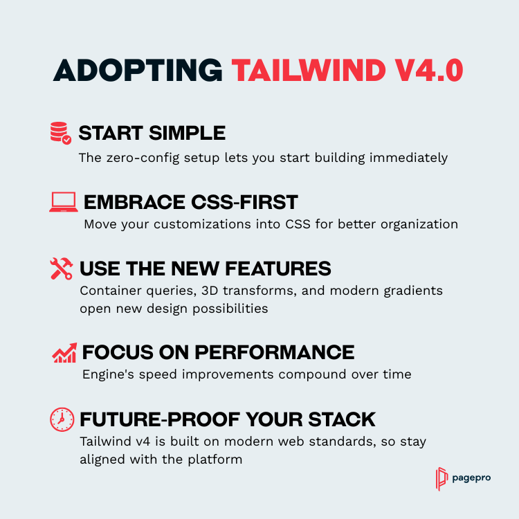
Key Takeaways for Adopting Tailwind v4.0
Building with Tailwind CSS Framework
Tailwind CSS v4.0 marks the most significant evolution of the framework since its inception.
The Tailwind team has delivered us powerful new features like built-in container queries, 3D transforms, and CSS-first configuration that set a new standard for utility-first CSS frameworks. Many of the pain points developers complained about have been eliminated thanks to a zero-configuration setup, automatic content detection, and CSS-first customization.
This new version of Tailwind CSS offers a developer experience that combines the speed and flexibility we love with performance improvements that will transform your web development.
Sounds interesting? Then install Tailwind CSS v4.0 with Next.js and Turbopack today and discover what’s possible when performance meets developer experience at unprecedented speed.
Need help with your Tailwind Project?