
TL;DR
- Core idea: Compose designs with atomic classes (e.g.,
bg-blue-500 p-4 flex) instead of writing traditional CSS rules. - Key benefits: Speeds up development, eliminates class-name overthinking, simplifies code reviews, enables easy responsive/dark mode, and produces tiny production CSS via purging/unused style removal.
- Popular in 2026: Over 93,400 GitHub stars and ~18–45 million weekly npm downloads (v4.1.18 stable).
- Best for: Custom, performant UIs (vs. component-heavy frameworks like Bootstrap).
- Used by: OpenAI, Shopify, Loom, NASA, GitHub, and countless modern web apps.
What is Tailwind CSS?
Tailwind CSS is a utility-first CSS framework that allows developers to build user interfaces by composing small, reusable utility classes directly in HTML, rather than writing custom CSS stylesheets.
Tailwind is one of the most popular CSS frameworks right now, used by OpenAI, Shopify or Loom. It’s utility-based, making dev’s work easier and enabling rapid UI development.
Today I will discuss what exactly it is, what are its main benefits and how to configure it. And believe me, once you try it, you won’t want to use anything else.
Quick Facts about Tailwind CSS (as of February 2026)
- GitHub Stars: Over 93,400 stars on the official repository
View on GitHub - Weekly npm Downloads: Approximately 17–18 million for v4.1.x (latest stable), with total ecosystem usage exceeding 40 million weekly
npm Package Stats
Detailed Download Trends - Latest Stable Version: v4.1.18 (released December 11, 2025)
Release Notes - Popular Adopters: Used by companies like OpenAI, Shopify, Loom, NASA, GitHub, and many more modern web projects.
Is Tailwind CSS a Framework?
Yes, Tailwind CSS is a CSS framework — specifically, it is a utility-first CSS framework.
The official Tailwind CSS website describes it as:
“A utility-first CSS framework for rapidly building modern websites without ever leaving your HTML.”
Unlike traditional component-based frameworks (such as Bootstrap or Material UI), which give you ready-made, opinionated components like buttons, cards, navbars, and modals, Tailwind provides low-level utility classes (e.g., bg-blue-500, p-4, flex, text-center) that you combine directly in your HTML to build exactly what you want.
This utility-first approach gives you:
- Maximum flexibility and customization
- No need to fight against prebuilt component styles
- Smaller production CSS files (thanks to purging unused classes)
- Faster iteration once you’re familiar with the system
Tailwind CSS vs. Bootstrap: Quick Comparison
| Feature | Tailwind CSS | Bootstrap |
|---|---|---|
| Type | Utility-first | Component-based |
| Styling Approach | Compose small utility classes in HTML | Use prebuilt components and override styles |
| Customization | Very high (build unique designs easily) | Medium (requires overriding defaults) |
| File Size (minified) | ~10KB (after purging) | ~150KB+ (even minified) |
| Best For | Custom, modern UIs, performance-focused apps | Rapid prototyping, consistent look across teams, MVPs |
| Learning Curve | Steeper initially (learn utilities) | Easier at first (use components quickly) |
In short: If your project needs heavy customization, unique branding, or top performance, Tailwind CSS is usually the stronger choice in 2026. If you want speed-to-launch with standardized components and less design decision-making, Bootstrap might still fit better.
Many developers (and companies like OpenAI, Shopify, and GitHub) choose Tailwind precisely because it feels more like “CSS with superpowers” than a rigid framework — but yes, it is very much a framework designed to solve real styling problems.
What is Tailwind CSS Used For?
Tailwind CSS is primarily used for rapidly building custom, responsive, and performant user interfaces directly in HTML (or JSX/TSX components) without writing separate CSS files or fighting framework defaults.
Because it provides thousands of low-level utility classes (e.g., flex, bg-gradient-to-r, shadow-lg, md:p-8, dark:text-gray-200), developers can compose exactly the look and feel they need — making it ideal for projects where design flexibility, speed, and consistency matter more than prebuilt components.
Here are the most common real-world use cases in 2026:
- Rapid UI development and prototyping
Build entire pages, landing pages, dashboards, or admin panels quickly by applying classes inline. Great for startups, MVPs, marketing sites, and design sprints where you need to iterate fast. - Custom design systems and branded applications
Create unique, on-brand experiences (e.g., SaaS products, web apps, e-commerce storefronts) without overriding heavy component styles. Companies like Shopify, OpenAI, and Loom use it for this reason — full control over colors, spacing, typography, and dark mode. - Modern component libraries and reusable UI kits
Teams build internal design systems or public libraries (e.g., with React, Vue, Svelte) using Tailwind utilities. Tools like Tailwind UI, DaisyUI, or shadcn/ui extend it further for consistent, copy-paste components. - Responsive and mobile-first websites
Tailwind’s built-in mobile-first breakpoints (sm:,md:,lg:, etc.) and variants make responsive layouts effortless — no separate media queries needed. Perfect for blogs, portfolios, documentation sites, and any site that must look great on phones, tablets, and desktops. - Performance-critical applications
Thanks to automatic purging of unused classes, production CSS bundles stay tiny (often <15 KB). Widely used in high-traffic apps, PWAs, and sites where load speed is critical. - AI-assisted and modern frontend workflows
In 2026, Tailwind’s predictable, atomic class names make it one of the best frameworks for AI coding tools (Copilot, Cursor, Claude, etc.). AIs generate accurate Tailwind markup reliably, speeding up development even more. - Hybrid or legacy modernization projects
Gradually introduce Tailwind into existing apps alongside vanilla CSS or other frameworks — no full rewrite required.
In short: Tailwind CSS is used wherever developers want speed without sacrificing customization, consistency across teams, and small, efficient production CSS — especially in React/Vue/Svelte ecosystems, SaaS products, internal tools, and design-heavy web applications.
If your project prioritizes unique branding, frequent design changes, or fast iteration over out-of-the-box components, Tailwind is typically the go-to choice in 2026.
Why Use Tailwind CSS?
- Ease of Learning and Rich Documentation
- Utility Classes Over Custom Classes
- No More Overthinking Class Names
- Quick Project Kickoff
- Simplified Code Reviews
Ease of Learning and Rich Documentation
If you are new to the project and Tailwind is used there it should be easy for you to catch up and you should be able to create your first PR with CSS changes pretty fast. Documentation is great, you can find almost everything there. You can also find some cheat sheets on the web, but the documentation itself is also very readable and developer-friendly.
Utility Classes Over Custom Classes
Utility classes mean you don’t need to invent your own; you can assemble layouts and components from what is available. It’s well-paired with libraries like clsx to make modifying components easier.
No More Overthinking Class Names
It saves time – you don’t have to think of new class names. Everything is added and modified within the element, so you won’t break other elements while changing styles in some other place.
Streamlined CSS Management
You don’t have to create separate files to add CSS to each component (unless you want to, which is not forbidden 🙂), and you can see all of the applied styles while looking at the HTML. Tailwind CSS works by scanning all of your HTML files, JavaScript components, and any other templates for class names, generating the corresponding styles, and then writing them to a static CSS file. This makes the size of the app smaller because you’re not loading any unnecessary styles.
Quick Project Kickoff
It’s quicker to kick off the project because the base is already there, and multiple people can start working on the styles earlier; only the tailwind config has to be configured. You don’t have to use methodologies like BEM to make the code consistent.
Simplified Code Reviews
While doing a Code Review, you don’t have to jump between the files to check if the styles are okay for the given HTML structure; you can see everything in one place.
Do you have questions about Tailwind CSS?
How Does Tailwind CSS Work?
Tailwind CSS works by letting you style elements directly in your HTML (or JSX/TSX) using thousands of small, single-purpose utility classes (like bg-blue-500, p-4, flex, md:text-lg). Instead of writing custom CSS rules in separate files, you compose your design right in the markup.
Under the hood, Tailwind uses a smart build process (powered by its high-performance Oxide engine in v4+) to generate only the CSS you actually need. Here’s how it happens step by step:
You write utility classes in your HTML/JS files
Tailwind scans your project files (HTML, JS, TSX, etc.) for any tokens that look like class names — no need to parse code deeply; it just looks for strings matching its utility patterns.
Example:
```html
   <div class="bg-gradient-to-r from-indigo-500 via-purple-500 to-pink-500 p-6 rounded-xl shadow-2xl text-white md:p-10">
     <h2 class="text-3xl font-bold">Hello Tailwind!</h2>
   </div>
Tailwind CSS vs Traditional CSS Comparison
Compared to traditional CSS methods where styles are added globally and can cause issues when modified elsewhere, Tailwind ensures that unused classes are not added to the app. You can also use it in conjunction with traditional CSS if needed.
What is Tailwind vs Tailwind CSS?
“Tailwind” is simply the common shorthand name for Tailwind CSS. There is no separate product, tool, or entity called “Tailwind” (singular) or “Tailwinds” (plural) in the context of web development or CSS frameworks.
People often search for or refer to it as:
- Tailwind
- Tailwind CSS
- Tailwinds (a very common typo or pluralization mistake)
All of these point to the same thing: the utility-first CSS framework created by Tailwind Labs (tailwindcss.com), released in 2019, and widely used today (v4.1 as of February 2026).
- There is no standalone “Tailwind” app, library, or service outside of Tailwind CSS and its official ecosystem products (e.g., Tailwind UI, Tailwind Labs’ component marketplace).
- “Tailwinds” does not refer to any official frontend tool — it’s almost always a misspelling when people mean Tailwind CSS.
If you’re seeing “Tailwind” mentioned in modern web dev discussions, React/Vue/Svelte projects, design system talks, or AI-assisted coding workflows, it’s safe to assume it’s referring to Tailwind CSS.
(Quick check: The official site, GitHub repo, and npm package are all named tailwindcss — the “CSS” part is explicit there.)
Pros and Cons of Tailwind CSS
Tailwind CSS is loved by many developers for its speed and flexibility, but like any tool, it has trade-offs. Below is a balanced look at the biggest advantages and disadvantages in 2026.
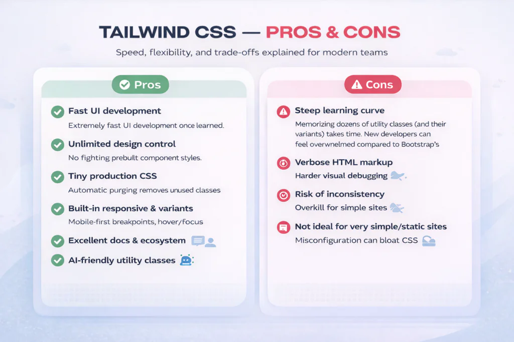
Pros
- Extremely fast UI development once learned
You can build complex, custom interfaces in minutes by composing classes inline — no context switching to separate CSS files. - Maximum design freedom and customization
No fighting prebuilt component styles. You get pixel-perfect control over every element without overrides or !important hacks. - Tiny production CSS files
Automatic purging removes unused classes, often resulting in final bundles of 10–15 KB gzipped — great for performance and Core Web Vitals. - Built-in responsive design and variants
Mobile-first breakpoints, hover/focus/dark mode, and state variants are just a prefix away (e.g.,md:p-8,dark:bg-gray-900,hover:shadow-xl). - Excellent documentation and ecosystem
The official docs are clear, searchable, and constantly updated. Huge community support, plugins, and tools (Tailwind UI, Headless UI, DaisyUI, shadcn/ui, etc.). - Streamlined collaboration and code reviews
Styles live right in the HTML — reviewers see everything in one place without jumping between files. - Predictable and AI-friendly
Atomic classes make it ideal for AI coding assistants (Copilot, Cursor, etc.) in 2026 — they generate accurate Tailwind markup reliably.
Cons
- Steep initial learning curve
Memorizing dozens of utility classes (and their variants) takes time. New developers can feel overwhelmed compared to Bootstrap’s more intuitive components. - HTML can become very verbose
Long class strings (e.g.,class="flex flex-col items-center justify-center bg-gradient-to-br from-purple-600 to-blue-500 p-8 rounded-2xl shadow-2xl md:p-12 lg:flex-row") make markup harder to read and maintain. - Debugging can be trickier
When something looks wrong, you may need to inspect many classes across elements instead of one CSS rule. Browser dev tools help, but it’s not as straightforward as traditional CSS. - Risk of design inconsistency without discipline
Without a design system or strict team guidelines, different developers can create visually mismatched UIs using arbitrary values or conflicting utilities. - Not ideal for very simple/static sites
For basic landing pages or blogs with minimal styling, vanilla CSS (or lighter tools like Pico CSS) can be faster to set up with less overhead. - Bundle size can grow if not configured properly
While purging is automatic, heavy use of arbitrary values ([color:#123456]) or not purging safelisted classes can bloat output slightly.
When to Choose Tailwind (and When Not To)
- Choose Tailwind if your project needs custom design, frequent UI changes, performance focus, or modern frontend workflows (React/Vue/Svelte + AI tools).
- Consider alternatives (Bootstrap, Bulma, vanilla CSS, or lighter utilities) if you want rapid prototyping with prebuilt components, have a small/legacy team, or need the absolute simplest setup.
Most teams that adopt Tailwind report that the pros far outweigh the cons after the first 1–2 weeks of adjustment — but it’s not a one-size-fits-all tool.
Configuring Tailwind CSS
Initial Setup
The first thing you have to do when adding this framework to your project is to update the `tailwind.config.js` file to match some values from the project’s design, like colours, spacings, and typography. You can overwrite the existing values completely, or just extend them. Each object can be modified separately – you can for example replace all of the colors, but leave the predefined spacings and extend them with one more.
// tailwind.config.js
module.exports = {
  theme: {
    extend: {
      colors: {
        'custom-blue': '#007bff',
        'custom-green': '#28a745',
      },
      spacing: {
        '72': '18rem',
        '84': '21rem',
        '96': '24rem',
      },
      fontFamily: {
        sans: ['Graphik', 'sans-serif'],
        serif: ['Merriweather', 'serif'],
      },
    },
  },
}
- We added
custom-blueandcustom-greento the color palette. - We introduced three new spacing values: 72, 84, and 96.
- We specified custom fonts for
sansandserif.
Responsive Layouts Made Easy
It’s easy to create responsive layouts. Tailwind uses a mobile-first breakpoint system and it comes with five predefined breakpoints that you can use. You can modify them or add new ones if you need. All of the changes will be visible in one line of code instead of a separate media query rule.
There are five default Tailwind CSS Breakpoints:
| Breakpoint prefix | Minimum width | CSS |
| sm | 640px | @media (min-width: 640px) { … } |
| md | 768px | @media (min-width: 768px) { … } |
| lg | 1024px | @media (min-width: 1024px) { … } |
| xl | 1280px | @media (min-width: 1280px) { … } |
| 2xl | 1536px | @media (min-width: 1536px) { … } |
// tailwind.config.js
module.exports = {
  theme: {
    screens: {
      'sm': '640px',
      'md': '768px',
      'lg': '1024px',
      'xl': '1280px',
      '2xl': '1536px',
      '3xl': '1920px', // Added a new breakpoint
    },
  },
}
In the example above, we keep the default breakpoints and add a 3xl breakpoint for larger screens.
Dark Mode Support
Out of the box, we can also set different styles when we are in light or dark mode.
Automatic Dark Mode
By default, Tailwind uses the prefers-color-scheme media feature. This means it automatically applies dark mode styles if the user’s system preference is set to dark mode.
// tailwind.config.js
module.exports = {
  darkMode: 'media',  // Automatic dark mode
};
/* Light mode styles */
body {
background-color: #fff;
color: #000;
}
/* Dark mode styles applied automatically based on system settings */
@media (prefers-color-scheme: dark) {
body {
background-color: #333;
color: #fff;
}
}Manual Dark Mode Toggling
If needed, you can also let users toggle dark mode manually using a selector-strategy. This involves adding or removing a dark class on the <body> to change styles.
Using CSS Variables with Tailwind
If you’re a fan of using CSS variables, you can use them here as well. You can declare them in `@layer base` (or somewhere else, it can be component-scoped), and then use them in the config file or use a square bracket notation to generate a class on the fly with any arbitrary value.
Conclusion
Tailwind is a very popular framework these days. You can find a lot of information about how to use it and modify it on the web. It’s used in more and more projects and makes devs’ lives easier. Writing code takes less time, code review is also pretty fast thanks to this and it’s pretty easy to learn for someone new. It can be tailored to the project’s needs easily and not used utility classes are not included in CSS, making the page lighter and faster.
Looking for experienced fronted developers?
Read more
Best React JS Tech Stack in 2024
Best React Native Tech Stack in 2024
UX and UI in mobile app development